5 Outdated Kitchen Paint Colors That Interior Designers Are Tired of Seeing
It may be time to retire these once beloved shades.
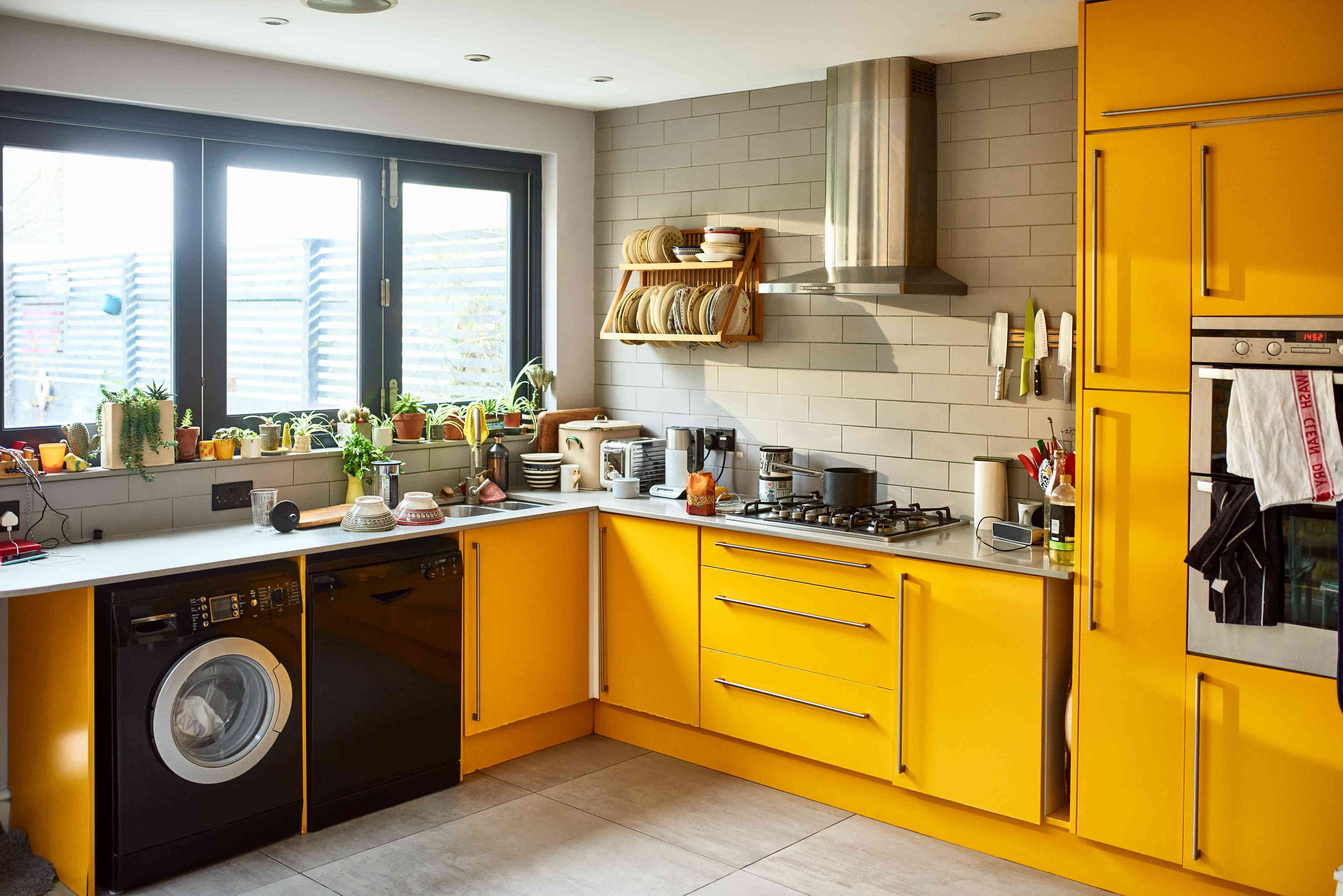
Paint trends come and go, but in the kitchen, the colors we choose tend to stick around. However, over the years, some shades have fallen out of favor—but calling them outdated isn’t always fair. Even overused colors can still look beautiful, depending on the space.
When it comes to color, it all comes down to context—like lighting, cabinetry, and how the hue plays against other materials. But if your goal is to freshen up your kitchen and make it feel more current, then color is a great place to start. Here are a few hues designers say are worth rethinking—and some expert advice for how to make them work.
Meet the Expert
- Alyssa Anselmo , architect and founder of Studio Anva
- Daniel Joseph Chenin , architect, interior designer, and founder of Daniel Joseph Chenin Ltd.
Related: Experts Rank the 10 Worst Paint Colors for Your Kitchen
Burnt Orange and Mustard Yellow
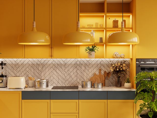
Burnt orange and mustard yellow are two very divisive colors, and in the kitchen, they can be especially tricky. While once considered warm and inviting, these bold hues now evoke a heavy, 1970s-esque vibe that’s hard to shake. They’re not inherently bad, but they can be difficult to modernize—particularly when used on permanent elements, like cabinetry or walls.
“These colors are emotionally charged," says Alyssa Anselmo, architect and founder of Studio Anva. She notes that, while there’s a certain charm to these retro tones, they’re best used with restraint.
"I would use [them] in smaller, more flexible ways, like objects or textiles, rather than painting an entire kitchen," she adds. "For example, a colorful toaster or coffee machine.”
Red Lacquer
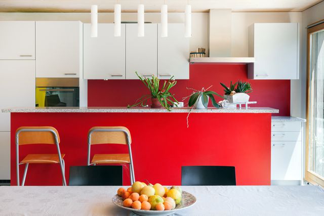
Red lacquered kitchens had a moment, particularly in ultramodern homes that leaned into bold, statement-making colors. But today, that glossy red can feel more aggressive than cutting-edge. The look often reads as synthetic, with a plastic shine that’s hard to tone down or integrate into a softer design.
The color itself also poses a challenge. “Red can be overpowering, and it quickly becomes visually exhausting in a space where you spend so much of your day,” Anselmo adds. “I would say a big no to a bright red, whether it’s lacquered or not.”
That said, she doesn’t believe you have to avoid these retro or “dated” colors altogether. Instead of committing to an entire kitchen in a bold hue, Anselmo recommends incorporating those tones in smaller, flexible ways —like a brightly colored stool, a ceramic bowl, or a statement light fixture.
Navy Blue
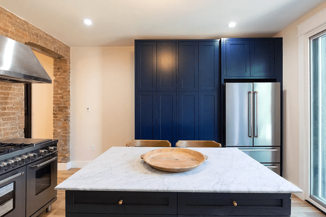
Navy blue has long been a favorite for kitchen cabinetry and islands. It was the go-to alternative to black or gray, and paired well with brass accents and marble countertops. But as architect and interior designer Daniel Joseph Chenin points out, navy’s popularity has made it feel a bit predictable.
In smaller kitchens, deep blue can feel heavy or overly formal, which isn’t always the vibe people want in a space where comfort matters. Chenin recommends looking to deep, earthy greens or muddy teals as fresher alternatives.
"These tones offer the same richness and depth, but feel more connected to nature, adding color without overwhelming the space," he says.
Charcoal Gray
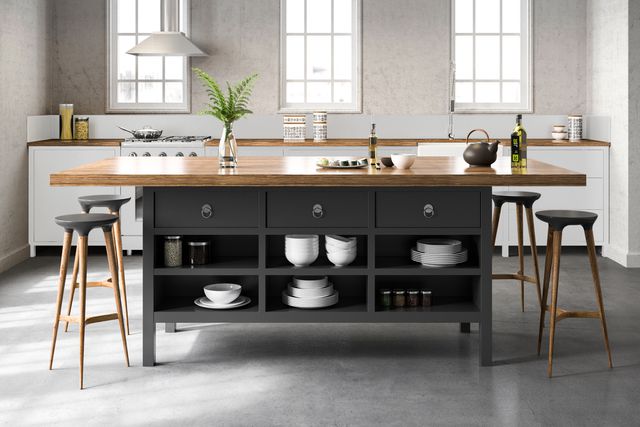
Charcoal gray became a staple in modern kitchens thanks to its strong, sleek contrast against white cabinetry. It was the perfect choice for creating that cool, urban vibe—but over time, the very qualities that made charcoal popular have started to work against it.
Chenin explains that charcoal can feel "cold and overly industrial, particularly when paired with other hard surfaces.” For a softer, more welcoming look, Chenin recommends swapping charcoal for warm grays with brown or taupe undertones. These shades help balance the space, especially when layered with natural wood or brass.
Bright White
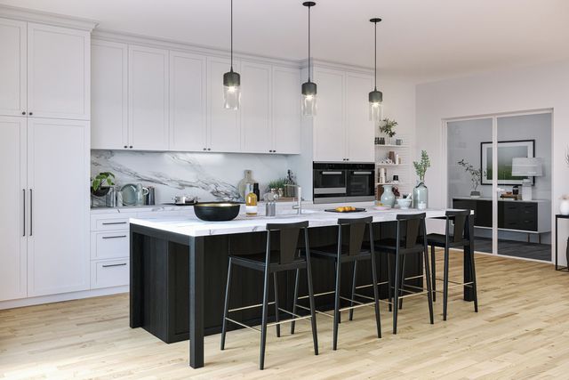
Glossy, white kitchens took off because they felt fresh, clean, and undeniably modern, especially in open-concept homes . The shiny surfaces reflected light beautifully, making kitchens feel bigger and airier.
But as Chenin points out, "that same glossy white can now feel a bit too clinical and unforgiving." Plus, glossy finishes are notorious for showing every fingerprint and smudge, which isn’t ideal in a busy kitchen. A better option is a warmer white with a matte or satin finish—think bone, ivory, or soft linen.
Read the original article on Martha Stewart
Post a Comment